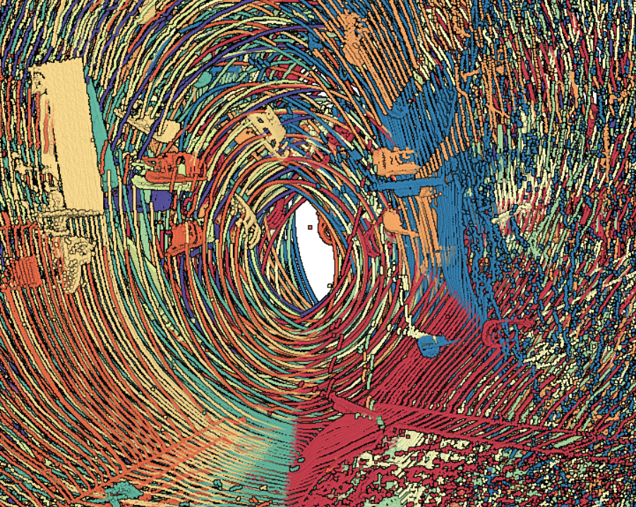
I was playing with datasets and wanted to share with what beautiful visualizations but wrong map alignment looks like.
![](https://i2.wp.com/sunapi386.ca/wordpress/wp-content/uploads/2019/02/image.png?fit=625%2C375)
The different colors represent scans but merged improperly (not aligned).
![](https://i2.wp.com/sunapi386.ca/wordpress/wp-content/uploads/2019/02/image-1.png?fit=625%2C375)
![](https://i0.wp.com/sunapi386.ca/wordpress/wp-content/uploads/2019/02/image-2.png?fit=625%2C355)
Looks like a mess.
![](https://i0.wp.com/sunapi386.ca/wordpress/wp-content/uploads/2019/02/image-3.png?fit=625%2C305)
But overall the coloring is important with debugging what this data represents.
Here’s what it looks like all merged together properly.
![](https://i0.wp.com/sunapi386.ca/wordpress/wp-content/uploads/2019/02/image-4.png?fit=625%2C339)
![](https://sunapi386.ca/wordpress/wp-content/uploads/2019/02/image-5.png)
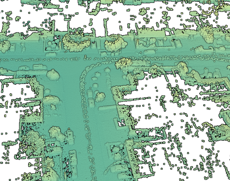
Especially the truck
![](https://i2.wp.com/sunapi386.ca/wordpress/wp-content/uploads/2019/02/image-6.png?fit=625%2C334)
![](https://i2.wp.com/sunapi386.ca/wordpress/wp-content/uploads/2019/02/image-7.png?fit=625%2C383)
Lidar map merging is a difficult task, and merging the data takes quite some time. So it is better to sample parts of a large data set and see if the algorithm is doing the right job.
![](https://sunapi386.ca/wordpress/wp-content/uploads/2019/02/image-8.png)
![](https://i2.wp.com/sunapi386.ca/wordpress/wp-content/uploads/2019/02/image-9.png?fit=625%2C381)
![](https://i2.wp.com/sunapi386.ca/wordpress/wp-content/uploads/2019/02/image-10.png?fit=625%2C384)
At least the lidar above were all in the same 2D plane.
Here’s what it looks like if they weren’t — a blob of mess.
![](https://i2.wp.com/sunapi386.ca/wordpress/wp-content/uploads/2019/02/image-11.png?fit=625%2C561)
double pitch = rtkMessage.pitch();
double yaw = – rtkMessage.heading();
![](https://i2.wp.com/sunapi386.ca/wordpress/wp-content/uploads/2019/02/image-12.png?fit=625%2C375)
![](https://sunapi386.ca/wordpress/wp-content/uploads/2019/02/image-13.png)
![](https://i0.wp.com/sunapi386.ca/wordpress/wp-content/uploads/2019/02/image-14.png?fit=625%2C441)
![](https://i1.wp.com/sunapi386.ca/wordpress/wp-content/uploads/2019/02/image-15.png?fit=625%2C453)
double pitch = deg2rad(rtkMessage.pitch());
double yaw = deg2rad(rtkMessage.heading());
![](https://i1.wp.com/sunapi386.ca/wordpress/wp-content/uploads/2019/02/image-16.png?fit=625%2C463)
double pitch = deg2rad(rtkMessage.pitch());
double yaw = – deg2rad(rtkMessage.heading());
![](https://i1.wp.com/sunapi386.ca/wordpress/wp-content/uploads/2019/02/image-17.png?fit=625%2C394)
I tried a bunch of different methods and it turns out that I was using degrees in place of radians.
Here’s what after 5 days of working on this problem I finally solved
![](https://i2.wp.com/sunapi386.ca/wordpress/wp-content/uploads/2019/03/image.png?fit=625%2C385)
![](https://i1.wp.com/sunapi386.ca/wordpress/wp-content/uploads/2019/03/image-1.png?fit=625%2C471)
![](https://i1.wp.com/sunapi386.ca/wordpress/wp-content/uploads/2019/03/image-2.png?fit=625%2C321)
![](https://i2.wp.com/sunapi386.ca/wordpress/wp-content/uploads/2019/03/image-3.png?fit=625%2C338)
![](https://i1.wp.com/sunapi386.ca/wordpress/wp-content/uploads/2019/03/image-4.png?fit=625%2C146)
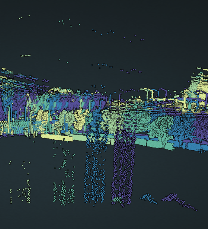
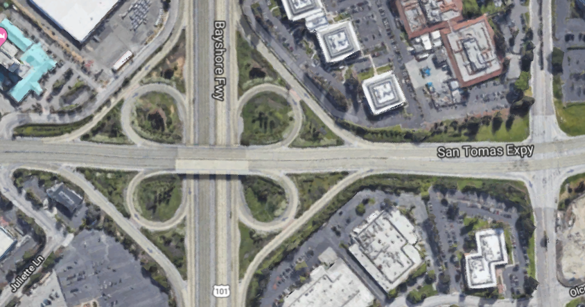
Here’s what the Google Maps view looks like
![](https://sunapi386.ca/wordpress/wp-content/uploads/2019/03/image-5.png)
And here’s what the lidar point cloud data only looks like
![](https://i2.wp.com/sunapi386.ca/wordpress/wp-content/uploads/2019/03/image-6.png?fit=625%2C323)
Different view
![](https://i2.wp.com/sunapi386.ca/wordpress/wp-content/uploads/2019/03/image-7.png?fit=625%2C256)
![](https://i0.wp.com/sunapi386.ca/wordpress/wp-content/uploads/2019/03/image-8.png?fit=625%2C242)
Construction crane can be seen here.
![](https://i2.wp.com/sunapi386.ca/wordpress/wp-content/uploads/2019/03/image-9.png?fit=625%2C397)
![](https://i1.wp.com/sunapi386.ca/wordpress/wp-content/uploads/2019/03/image-10.png?fit=625%2C403)
Very interesting in the map stitch process!